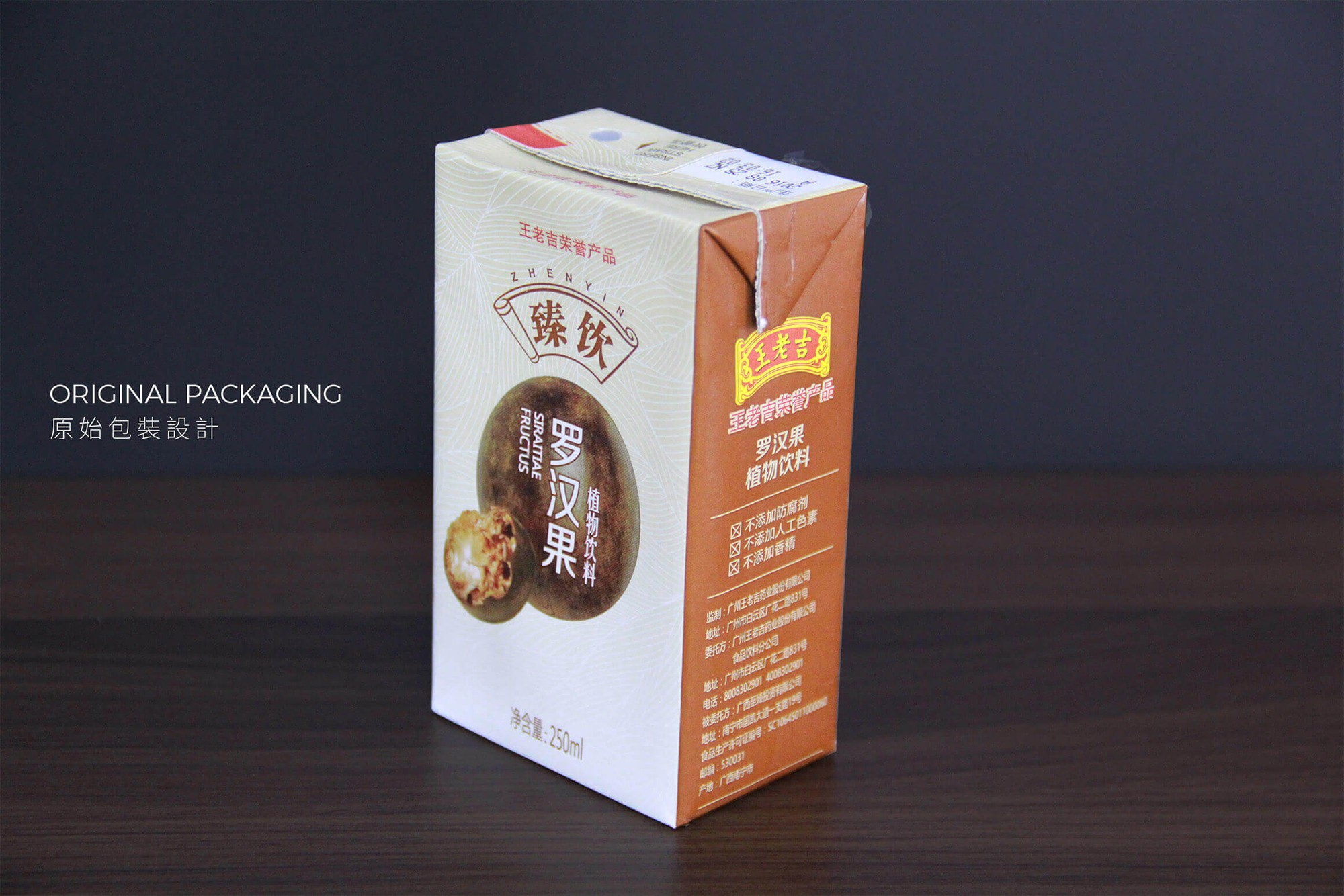
臻飲羅漢果
廣西至臻與王老吉合作生產臻飲羅漢果飲料,為了吸引年輕消費者而進行了全新的包裝設計。深入了解當地飲品市場後,我們將傳統包裝轉變為更適合日常飲用的風格。現代明亮風格突顯羅漢果飲料的甜美與清涼效果,以吸引年輕消費者。


Services
Package Design
Client
⎯
廣西至臻投資有限公司
|
Year
⎯
2016
Process
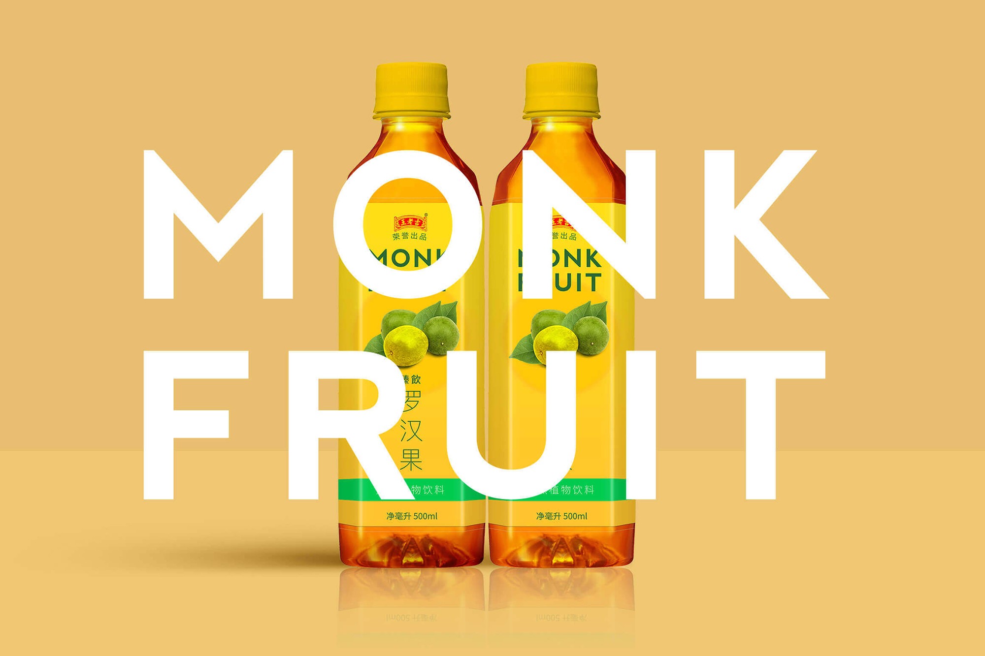
從傳統補品到日常清涼,焕然一新。
廣西至臻為王老吉之合作夥伴,不僅生產王老吉飲品,還推出當地名產的自家飲品 ⎯ 臻飲羅漢果飲料。羅漢果自古以來是一種被視為天然清涼飲料的瑰寶。然而,針對年輕消費者群體,傳統包裝已難以吸引眼球,於是我們展開了全新的設計挑戰。
在接觸這個案子之前,我們對羅漢果並不熟悉,直到在洽談中真的品嚐過,才理解這是廣西當地的一種常見涼茶。我們希望挑戰將這種歷史悠久、實際具有消暑功效的老牌飲品轉變成適合每日飲用。
我們特地前往廣西,深入瞭解了當地飲品市場現況及競爭者,踏遍從雜貨店到大賣場的各種通路,以此為基礎改進了包裝,能更符合消費者視覺和口感的期待。最終與主事者達成的共識是,要朝向年輕化但不過於前衛的設計方向投入市場。
首先,我們從包裝的資訊上著手,將難以理解的學名改成通俗易懂的 "Monk Fruit",並將其提升為包裝上強而有力的視覺元素之一。接著是改變包裝的色彩,我們選擇了能夠讓人聯想到羅漢果甜美口感的黃色,取代了先前的咖啡色/米色包裝;同時將一般人對於羅漢果的深色印象轉變為帶有新鮮感的綠色,搭配清晰明亮的產品內容和現代感十足的字體,詮釋目標消費者對於羅漢果飲品的期待。
Process
From traditional tonics to everyday refreshment, a whole new vibe.
Guangxi Zhenzhen, as a partner of Wanglaoji, doesn't just produce Wanglaoji drinks but also introduces its own beverage, Zhen Drink Luo Han Guo. Luo Han Guo has long been treasured as a natural coolant. However, traditional packaging struggles to appeal to younger consumers. Therefore, we embarked on a fresh design challenge.
Before this project, we weren't familiar with Luo Han Guo until we tasted it during discussions, realizing it's a popular local cooling tea in Guangxi. Our aim was to make this traditional beverage suitable for daily consumption.
We visited Guangxi to understand the local beverage market and competitors, exploring various channels. Based on our research, we redesigned the packaging to better meet consumer expectations in both visuals and taste, opting for a youthful but not overly avant-garde design direction agreed upon with stakeholders.
We simplified the scientific name to "Monk Fruit" for clearer communication on the packaging. The color scheme was refreshed to a vibrant yellow, reminiscent of Luo Han Guo's sweetness, replacing the previous dull tones. Transitioning from a dark impression to a lively green, complemented by modern typography, the new design captures the essence of Luo Han Guo for today's consumers.


All Works


All Works
All Works