Glou Suru

咕嚕蘇嚕

Glou Suru 是一間位於台中的全新概念麵吧,由鳥苑主廚 Tommy 與屏東 AKAME 主廚 Alex 聯手打造。品牌名稱融合飲食的聲音想像 —— glou(喝酒聲)與 suru(吸麵聲),是對吃喝最直覺、最純粹的描繪。這裡不追求形式與過度裝飾,而是以簡單卻細膩的麵食、小食與風格調酒,讓飲食回到日常、回到自己。

Glou Suru 是一間位於台中的全新概念麵吧,由鳥苑主廚 Tommy 與屏東 AKAME 主廚 Alex 聯手打造。品牌名稱融合飲食的聲音想像 —— glou(喝酒聲)與 suru(吸麵聲),是對吃喝最直覺、最純粹的描繪。這裡不追求形式與過度裝飾,而是以簡單卻細膩的麵食、小食與風格調酒,讓飲食回到日常、回到自己。

Glou Suru 是一間位於台中的全新概念麵吧,由鳥苑主廚 Tommy 與屏東 AKAME 主廚 Alex 聯手打造。品牌名稱融合飲食的聲音想像 —— glou(喝酒聲)與 suru(吸麵聲),是對吃喝最直覺、最純粹的描繪。這裡不追求形式與過度裝飾,而是以簡單卻細膩的麵食、小食與風格調酒,讓飲食回到日常、回到自己。

作品摘要

✦ 專案概述:輕鬆的麵吧,結合麵食、小食與調酒的餐酒館。

✦ 消費族群:以重視品味、熱愛生活節奏的都市女性為核心,追求自在、自然的飲食體驗。

✦ 品牌理念:強調不做作的生活態度與自我呈現,主張自然的節奏、輕鬆的相聚與自信的生活方式。

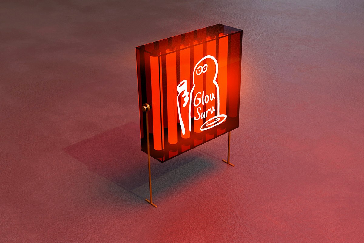
✦ 視覺形象:手繪線條與俏皮角色組成的品牌標誌,打造自由、不拘一格的識別系統。

Client

咕嚕蘇嚕餐廳有限公司

Year

2025

Categories

Branding

Visual Identity

Strategy

Intro

Intro

Intro

一碗麵一杯酒,生活的美好配方

Glou Suru 是一間沒有制式規則的麵吧,由鳥苑主廚 Tommy 與屏東 AKAME 主廚 Alex 聯手打造。這裡不追求過度裝飾,而是以簡單卻細膩的麵食、小食與風格調酒,讓飲食回到日常,回到直覺。

品牌命名來自「glou」(喝酒聲)與「suru」(吸麵聲),是一種關於吃與喝的聲音想像,也是我們對飲食本能的重新感受。這份直覺性也延伸至整體視覺設計:品牌標誌以手繪線條構成俏皮角色,筆觸自由、不對稱,保有創作的痕跡與城市感的幽默。

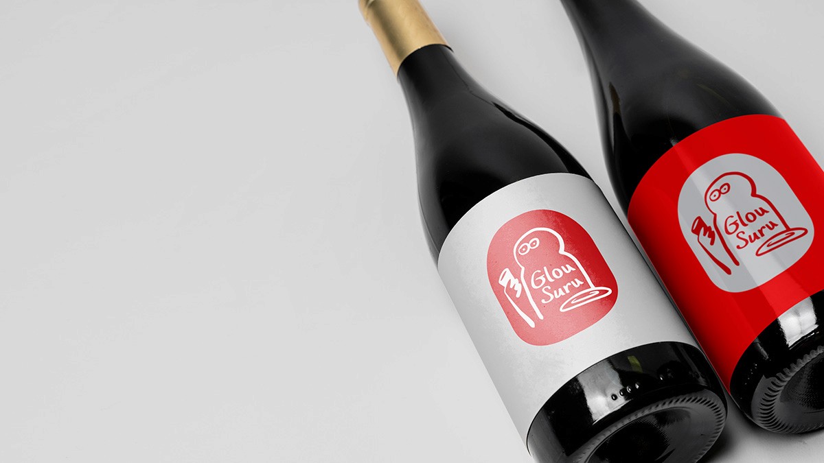
紅色作為品牌主色,承載了兩位主廚對直火與燒烤的熱愛與敬意,也傳遞品牌對每一道料理的專注與熱情。整體識別系統具備靈活延展性,從空間導引、菜單、杯墊到 T-shirt 等應用皆維持一致節奏與語調,讓品牌精神自然滲透至每個日常場景中。

Red

Pantone®

3546C / 3546U

CMYK

0, 71, 66, 15

RGB

216, 63, 74

Hex

#D83F4A

Red

Pantone®

3546C / 3546U

CMYK

0, 71, 66, 15

RGB

216, 63, 74

Hex

#D83F4A

Red

Pantone®

3546C / 3546U

CMYK

0, 71, 66, 15

RGB

216, 63, 74

Hex

#D83F4A

Green

Pantone®

5555C / 555U

CMYK

68, 33, 53, 9

RGB

92, 127, 118

Hex

#5C7F76

Green

Pantone®

5555C / 555U

CMYK

68, 33, 53, 9

RGB

92, 127, 118

Hex

#5C7F76

Green

Pantone®

5555C / 555U

CMYK

68, 33, 53, 9

RGB

92, 127, 118

Hex

#5C7F76

Grey

Pantone®

649C / 649U

CMYK

10, 7, 4, 0

RGB

230, 231, 239

Hex

#E6E7EF

Grey

Pantone®

649C / 649U

CMYK

10, 7, 4, 0

RGB

230, 231, 239

Hex

#E6E7EF

Grey

Pantone®

649C / 649U

CMYK

10, 7, 4, 0

RGB

230, 231, 239

Hex

#E6E7EF

White

CMYK

0, 0, 0, 0

RGB

255, 255, 255

Hex

#FFFFFF

White

CMYK

0, 0, 0, 0

RGB

255, 255, 255

Hex

#FFFFFF

White

CMYK

0, 0, 0, 0

RGB

255, 255, 255

Hex

#FFFFFF

Intro

Intro

Intro

Your Vibe, Your Drink, Always a Good Time.

Glou Suru is a rule-free noodle bar in Taichung, co-created by Chef Tommy of Torien and Chef Alex of AKAME. Here, the focus isn’t on over-styling, but on thoughtfully crafted noodles, small bites, and drinks — bringing eating and drinking back to instinct and everyday ease.

The name combines glou (the sound of drinking) and suru (the sound of slurping noodles) — a playful take on the sensory experience of food. This intuitive spirit carries through to the visual identity: a hand-drawn, asymmetrical logo character that feels spontaneous, expressive, and just a bit cheeky — like a sketch left on a napkin after a good meal.

The brand’s signature red pays homage to the chefs’ love for open flame and grilling. It expresses not only passion for cooking, but also the intention and care behind every dish. The visual system is built to flex across touchpoints — menus, coasters, T-shirts, and environmental graphics — maintaining a consistent tone and rhythm that lets the brand live naturally in every part of the experience.