MyAsiaTours Brand Identity
MyAsiaTours 品牌識別設計
作品摘要
✦ 專案概述: 為深耕亞洲旅遊的 MyAsiaTours Group,重新梳理品牌定位並建立完整的集團識別系統。:
✦ 品牌策略: 從「安排旅程」走向「理解旅人」,重新定位為以在地專業與深度策劃為核心的亞洲旅遊顧問品牌。
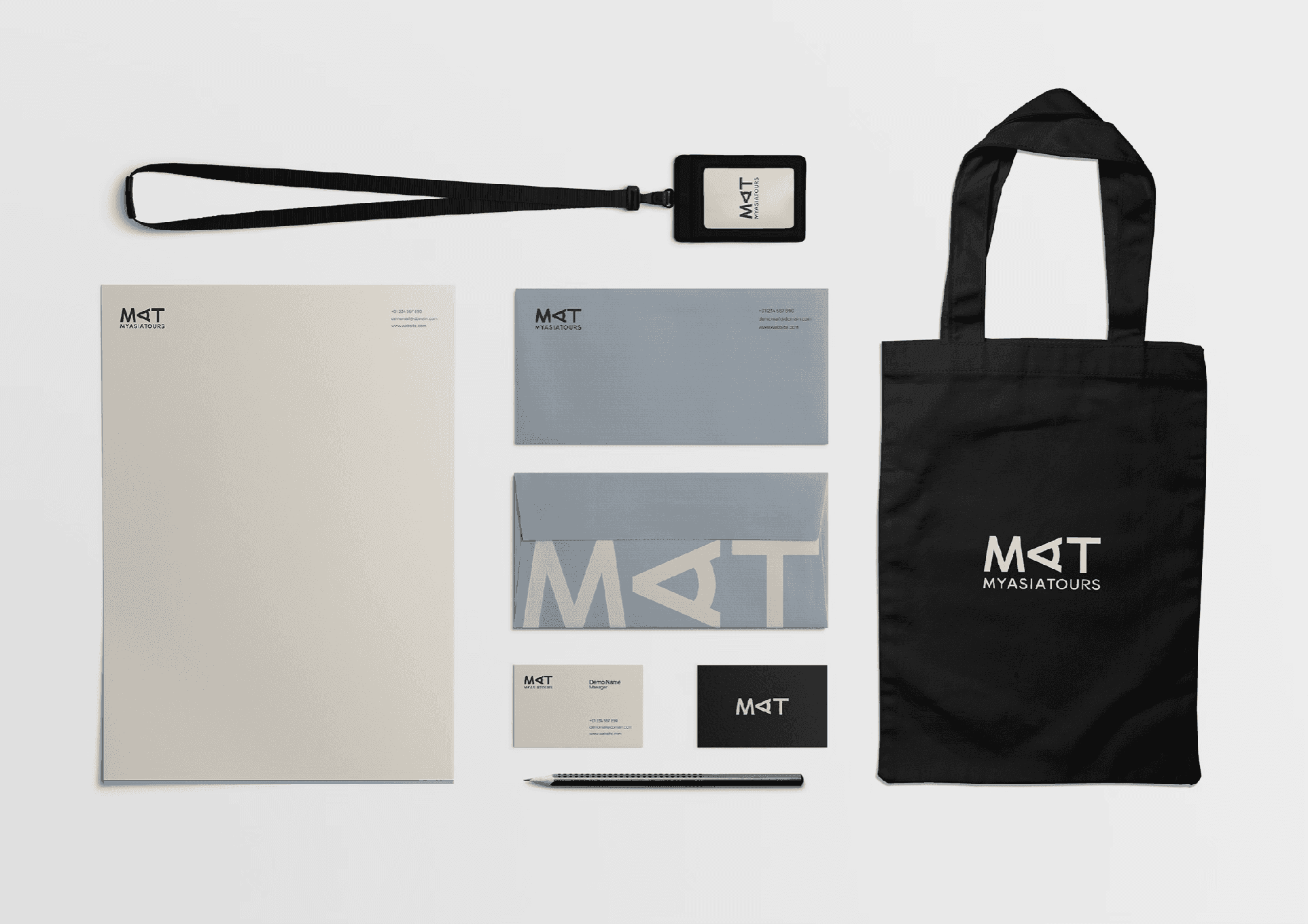
✦ 設計理念: 以探索與視野為核心,將 MAT 中的 A 轉化為望向遠方的雙眼,象徵對亞洲持續保持好奇與理解。
✦ 品牌形象: 以簡潔、現代且具國際感的視覺系統,平衡旅遊品牌的親近感與專業顧問的可信度。


Client
飛亞旅行社股份有限公司
Year
2026
Categories
Branding
Strategy
Intro
從理解開始,看見更大的亞洲
旅行不只是抵達目的地,更來自對旅人的理解。隨著 MyAsiaTours 從台灣逐步拓展亞洲市場,我們重新梳理品牌定位,將角色從提供旅遊服務,轉向以在地知識與深度策劃為核心的亞洲旅遊顧問品牌。
品牌策略以「理解、策劃、信任、專屬與細節」建立核心價值,並延伸出 Every Detail Matters 與 Every Moment Counts:一端代表對服務細節的堅持,另一端回到旅人真正帶走的每一個珍貴時刻。
視覺識別以 MAT 為核心,將字母 A 轉化為望向遠方的雙眼,象徵探索、視野,以及對亞洲不同文化持續保持好奇。整體以沉穩、低彩度的色彩建立品牌基調,在專業可信與旅行的溫度之間取得平衡。
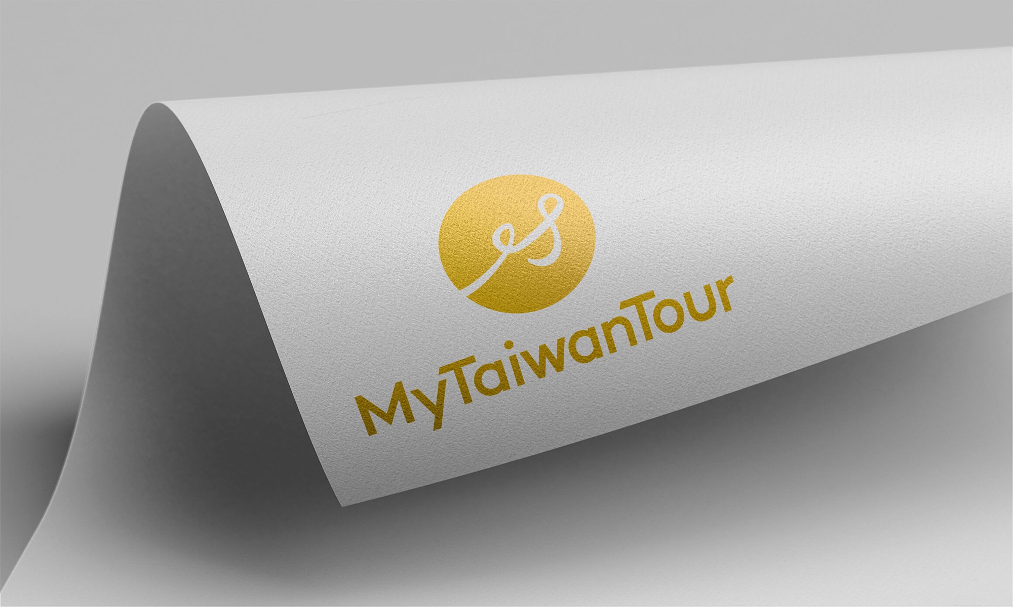
作為 MyTaiwanTour、MyJapanTour 等目的地品牌背後的母品牌,MAT 的色彩也刻意保持克制與包容,不搶走子品牌各自的個性,而像一個穩定的基底,在背後支撐不同目的地持續發展。從色彩到品牌架構,建立一套能隨著 MyAsiaTours 亞洲版圖共同成長的識別系統。

Intro
Understanding Travelers. Seeing Asia Differently.
Travel is about more than reaching a destination—it begins with understanding the traveler. As MyAsiaTours expands from Taiwan across Asia, we repositioned the brand from a travel service provider into an Asian travel consultancy shaped by local knowledge, thoughtful curation, and a deeper understanding of each journey.
The strategy brings together understanding, curation, trust, personalization, and attention to detail. These values are expressed through "Every Detail Matters" and "Every Moment Counts" — connecting the care behind every detail with the meaningful moments travelers ultimately take home.
The identity is built around "MAT", with the "A" reimagined as a pair of eyes looking outward — representing exploration, perspective, and curiosity toward the diverse cultures of Asia. A restrained, muted palette gives the brand a calm and grounded presence, balancing professional credibility with the warmth of travel.
As the parent brand behind destination brands such as MyTaiwanTour and MyJapanTour, MAT is intentionally designed to remain understated and adaptable — providing a neutral foundation that supports rather than competes with each destination’s own character. From color to brand architecture, the system is designed to grow alongside MyAsiaTours as it continues to expand across Asia.


MORE WORKS